Bryant Keller gives us a dramatic, bold entrance in this year's Kips Bay show house, celebrating it's 40th year. Those fashionable Scalamandré dancing zebras seem to be right on, right now! I was reminded of Mary McDonald's "red moment" in last year's entrance, here .
Bunny Williams, Brian J. McCarthy, and David Kleinberg paid tribute to their recently deceased mentor Albert Hadley, with a throughly modern mix of old and new pieces, an all gin bar, and a strong dose of red; all Hadley signatures.
"Visitors come to a show house for the fantasy, the playfulness, the flair of artistry," says Bunny Williams, this year's chairwoman. That's why I go. I want to be wowed. I want to see ingenuity and fantasy at its finest, and I am rarely disappointed!
Todd Romano's luxe aubergine and citrine dream of a dining room was a showstopper. Since the 2 condos at the The Aldyn were devoid of any of the classic architectural details that are generally the signature of the town homes used in past Kips Bay show houses, the designers really needed a narrative, a strong grounding focal point. Otherwise the rooms might have looked as if they could disappear into the water.
Brian de Toro's sitting room was a serene mix of modern classic incorporating a few trends we have been seeing a lot of ~ lacquer and green. Some of the designers were in their rooms the day Blogfest visited. Hi Brian, notice the beautiful appliquéd fabric sewn on the curtains, a nice detail.
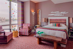
Coffinier Ku chose the bedroom to showcase a selection of Missoni fabrics because that's a room made for dreaming. With it's colorful clouds and butterflies, nature amid the organic elements that find their way into our dreams, the bedroom made perfect sense. I am always excited to see what this duo will come up with. The chevron fabric, lace-like in texture, was also set into the doors beautifully.
Neal Beckstedt took advantage of a stunning corner view of the city, the Hudson River and the private pool when creating this stylish urban lounge. I caught him doing a little housekeeping.
Alexander Doherty also created a timeless, tactile space for relaxing and reflecting. With an interior room, he created a gallery-like space with a background of bleached wood paneling.
There is so much more. Come back, won't you?
photos: CLI, Trevor Tondo for NYT


No comments: Kips Bay Show House 2012: Part Un
Post a Comment